Developing a scalable design system for multi-platform experiences.
AkzoNobel creates paint and performance coatings for industry and consumers worldwide. This project set out to migrate 100+ platforms onto one versatile, intelligent components library, starting with three MVP brand sites.

Overview
AkzoNobel is a Dutch multinational company that creates paint and performance coatings for both industry and consumers worldwide. Today, many enterprises and consumers now buy paint online. AkzoNobel aims to transform the digital experience of choosing and buying paint online and create a cohesive brand experience.
A crucial element in this digital transformation is to migrate 100+ platforms from Drupal to Adobe Experience Manager. This digital transformation started by creating a versatile and intelligent components library and scaling it brand by brand. To make this plan feasible, we began with three websites for MVP: Dulux, Flexa, and Lesonal.
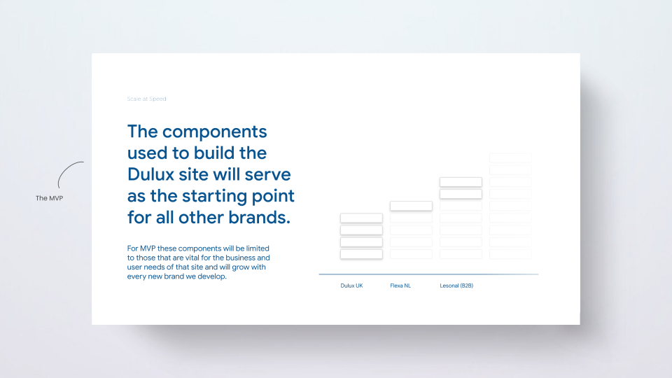
My challenge was to design a scalable design system in close collaboration with designers and developers, lead all aspects of the components life cycle, make difficult design decisions, and navigate political discussions with dozens of markets. It took six months to design and document the whole design system, including 10+ templates, 50+ components, and 16+ themes. The project is still going through the roll-outs to the rest of the markets.
We kicked off the project with a day-long meeting, where we discussed all the ins and outs of creating a design system for multiple complex platforms.
The nature of this work is confidential. Please don't disclose or use this information other than reviewing my work.
Research
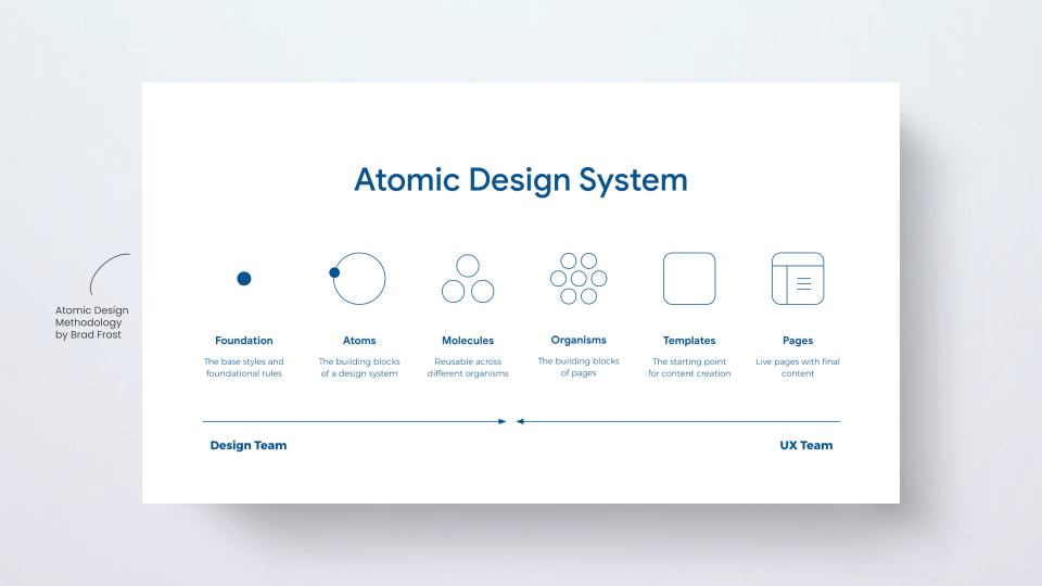
As a team, we first started with inspiration and references to other well-known design systems and shared examples of best practices. It led us to question how to organize the components in the best way possible. We took the Atomic Design Methodology by Brad Frost into account, and after a few discussions with the development team, we decided to go ahead with this approach.
While the design team started picking up the base styles and themes, the UX team scanned the pages to identify potential templates and components. In this case study, I'll only talk about the UX contributions to the project.
Audit
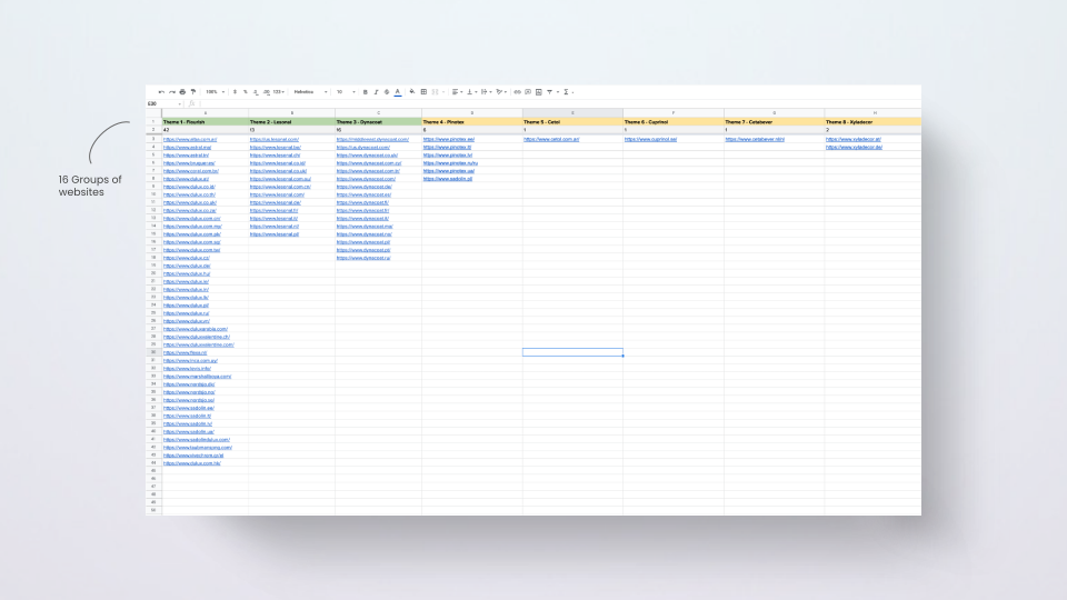
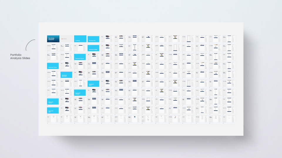
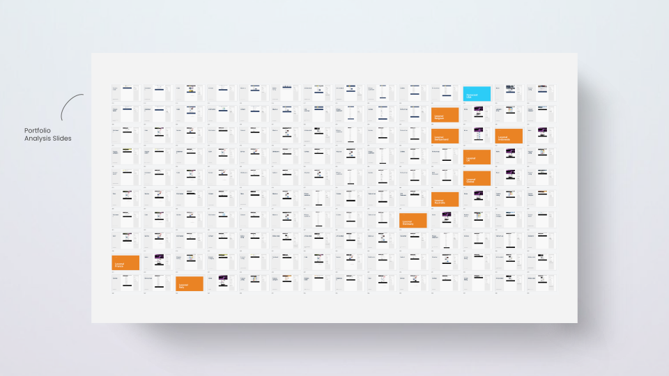
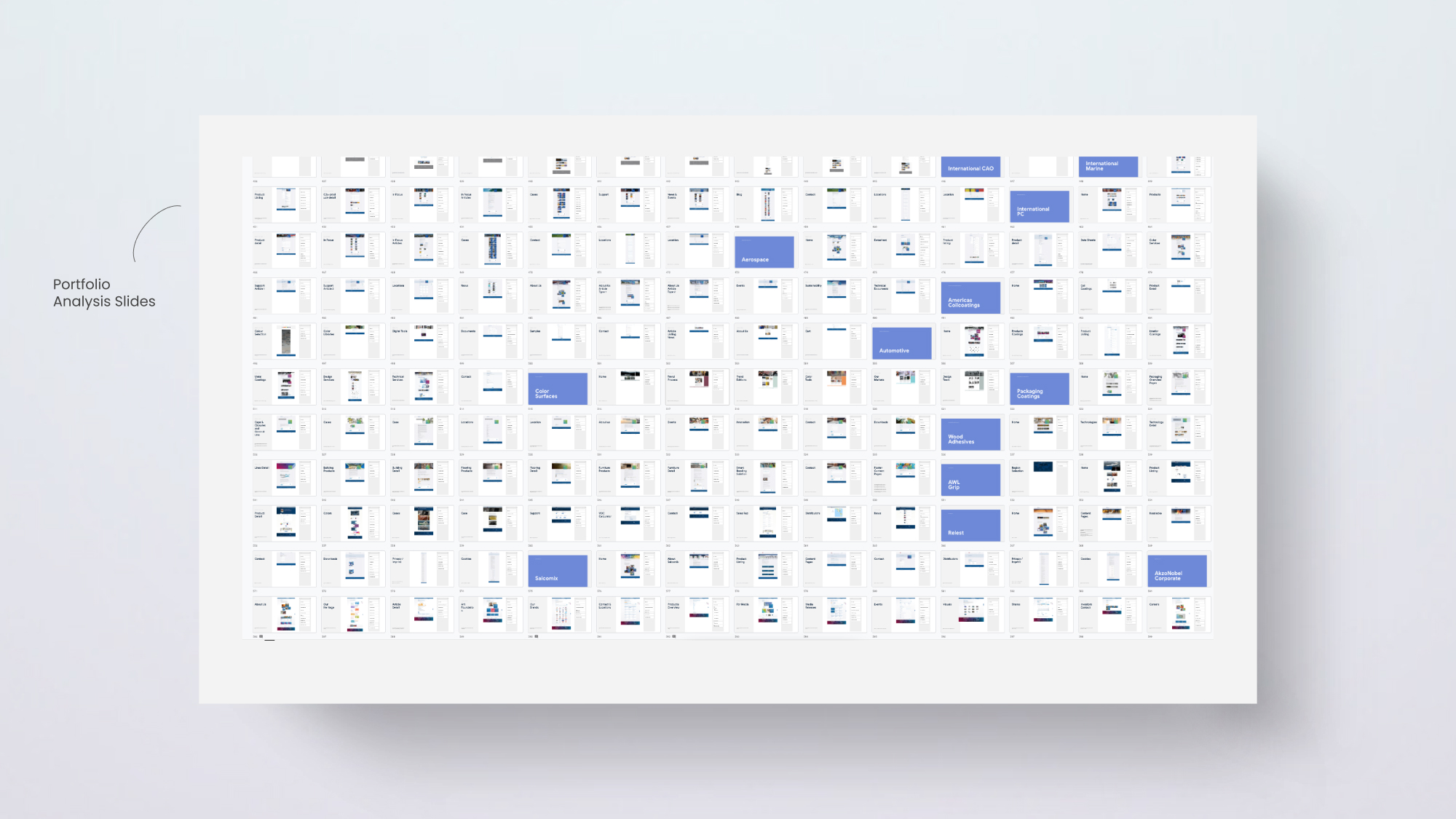
Before laying the foundation for a components library, we ran an audit of the existing UI to see what components could be combined, deprecated, or optimized. We categorized all websites into 16 groups based on the affinity of the brands. After that, we collected, screenshotted, and redlined all pages to identify potential components that would cater to all brands within AkzoNobel's portfolio.
Inventory
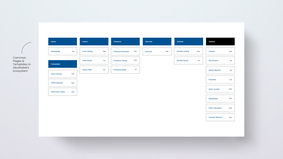
After countless discussions of whether it's a molecule or an organism, and prolonged redlining sessions, we compiled a final list of templates and components.
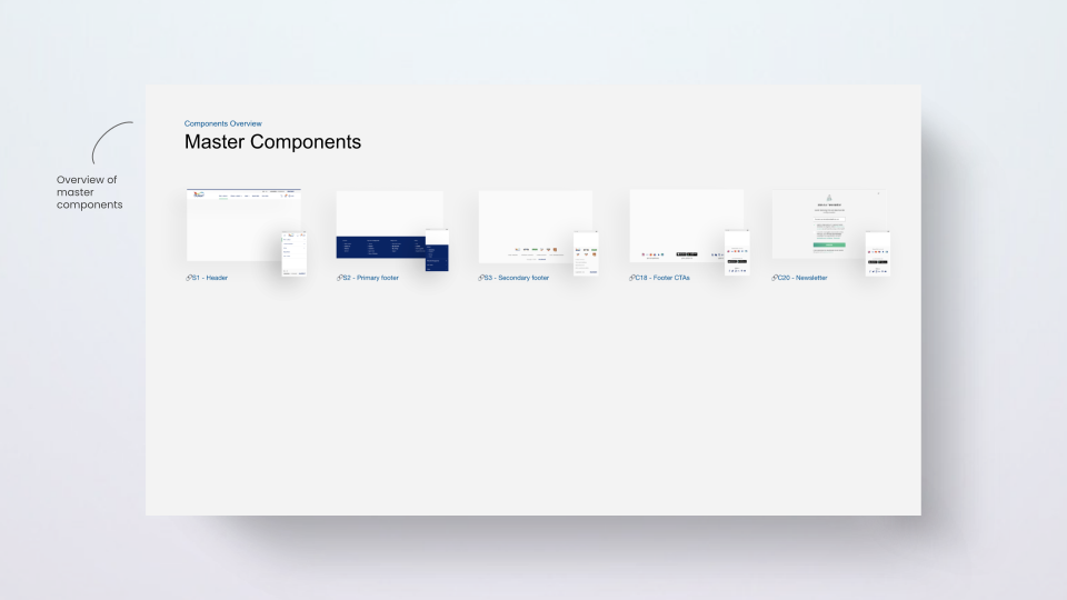
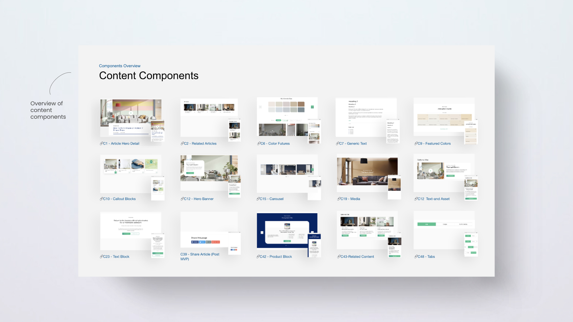
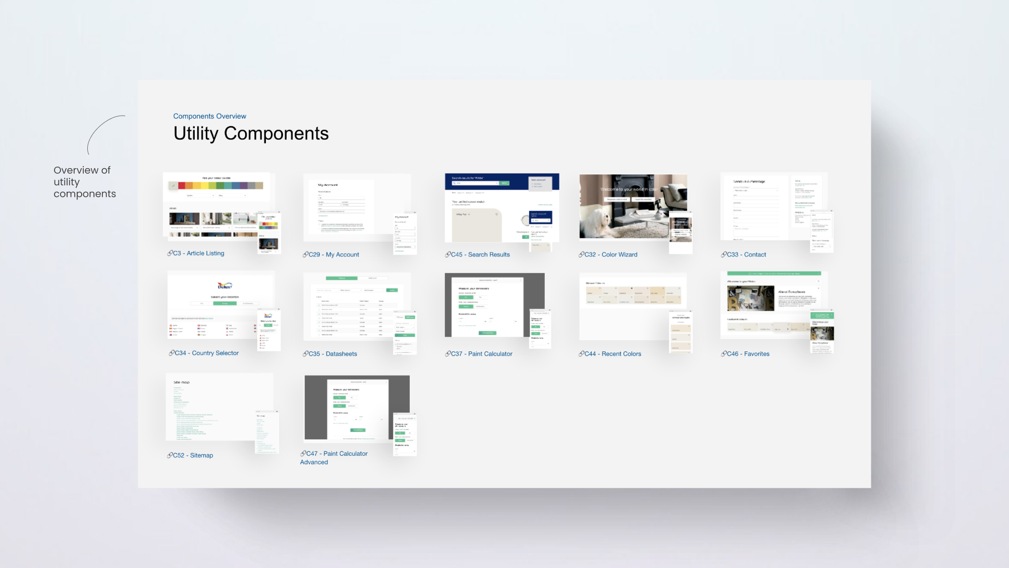
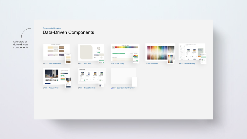
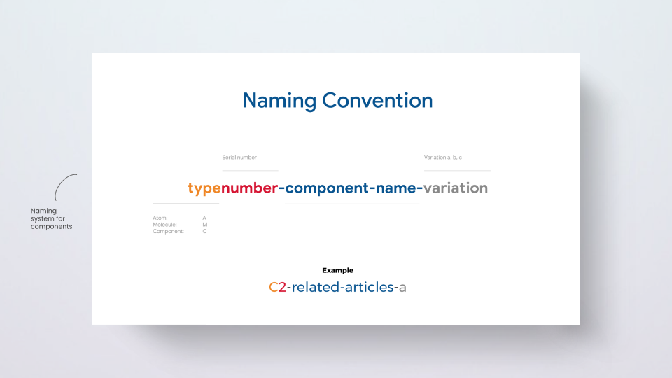
We also discussed many options for naming the components and decided on a consistent naming convention, which we then used across all disciplines, tools, and documentation.
Creation
We used an agile approach and aimed for ten sprints (two weeks per sprint) to deliver around 50 components. We tracked the progress through a components matrix spreadsheet.
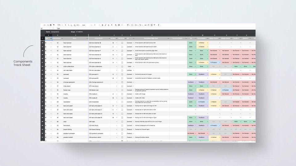
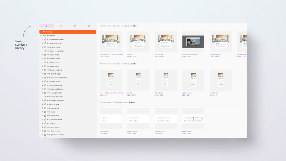
We also explored many tools to build and document the design system, including Figma, Sketch, and Adobe XD. Despite being ambitious about Figma, we chose Sketch and Zeplin because the client and stakeholders were already familiar with the workflow, and the design team had more experience using Sketch than Figma.
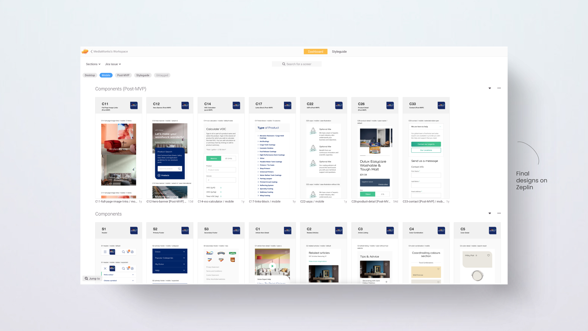
We then started setting up the symbols in Sketch, defining all possible states and variants of the components, and exported the final designs to Zeplin to share with the developers.
Documentation
Maintaining a single source of truth and carrying out extensive documentation was essential to keep everyone aligned in a large cross-functional team.
For this purpose, we delivered three types of documentation, which also allowed us to make each person on the team responsible for writing and maintaining their piece of it.
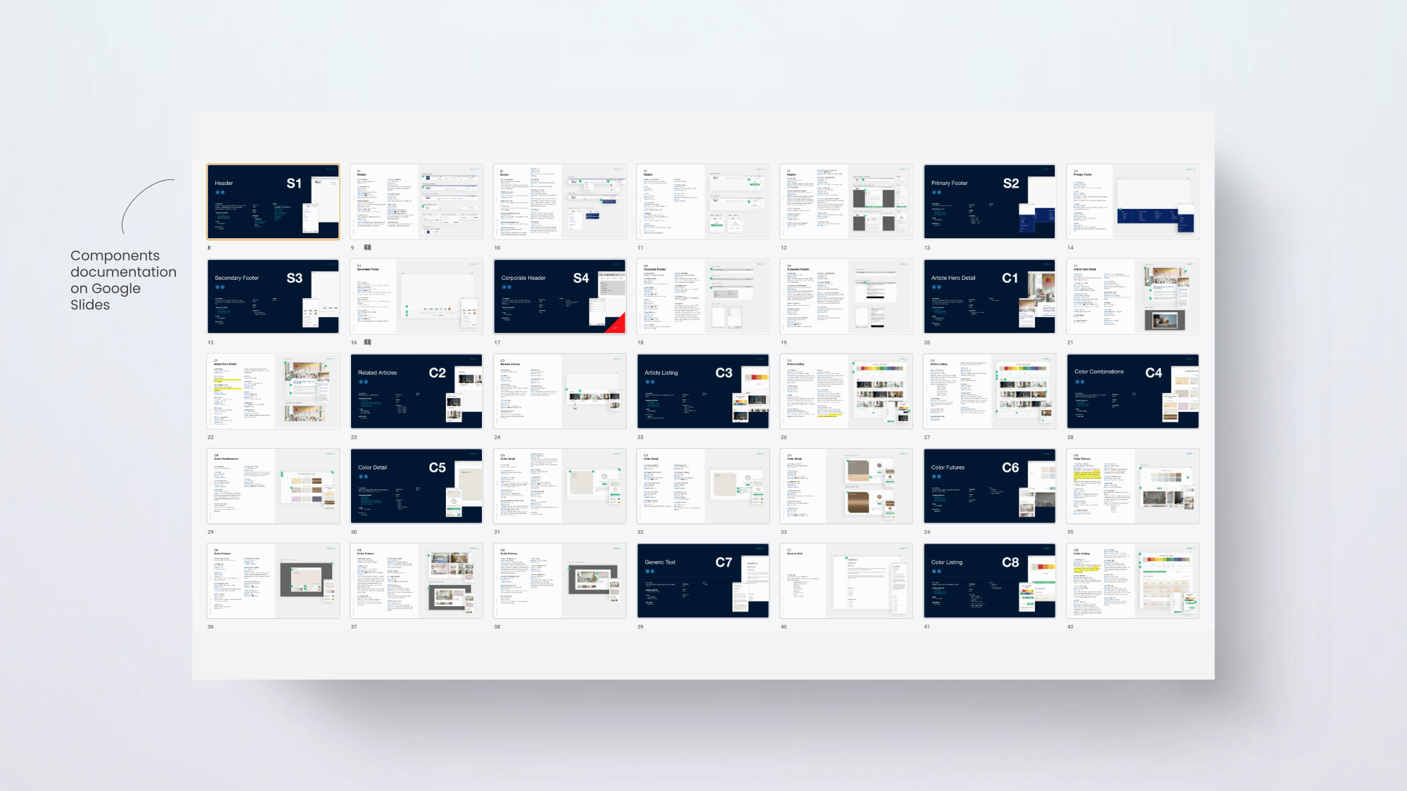
Components documentation
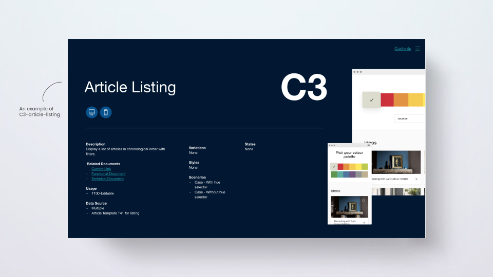
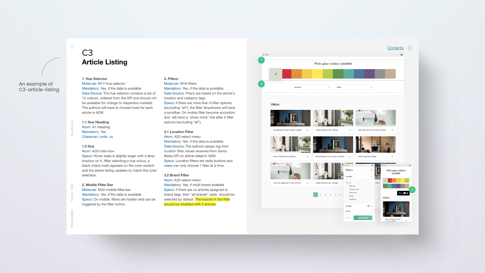
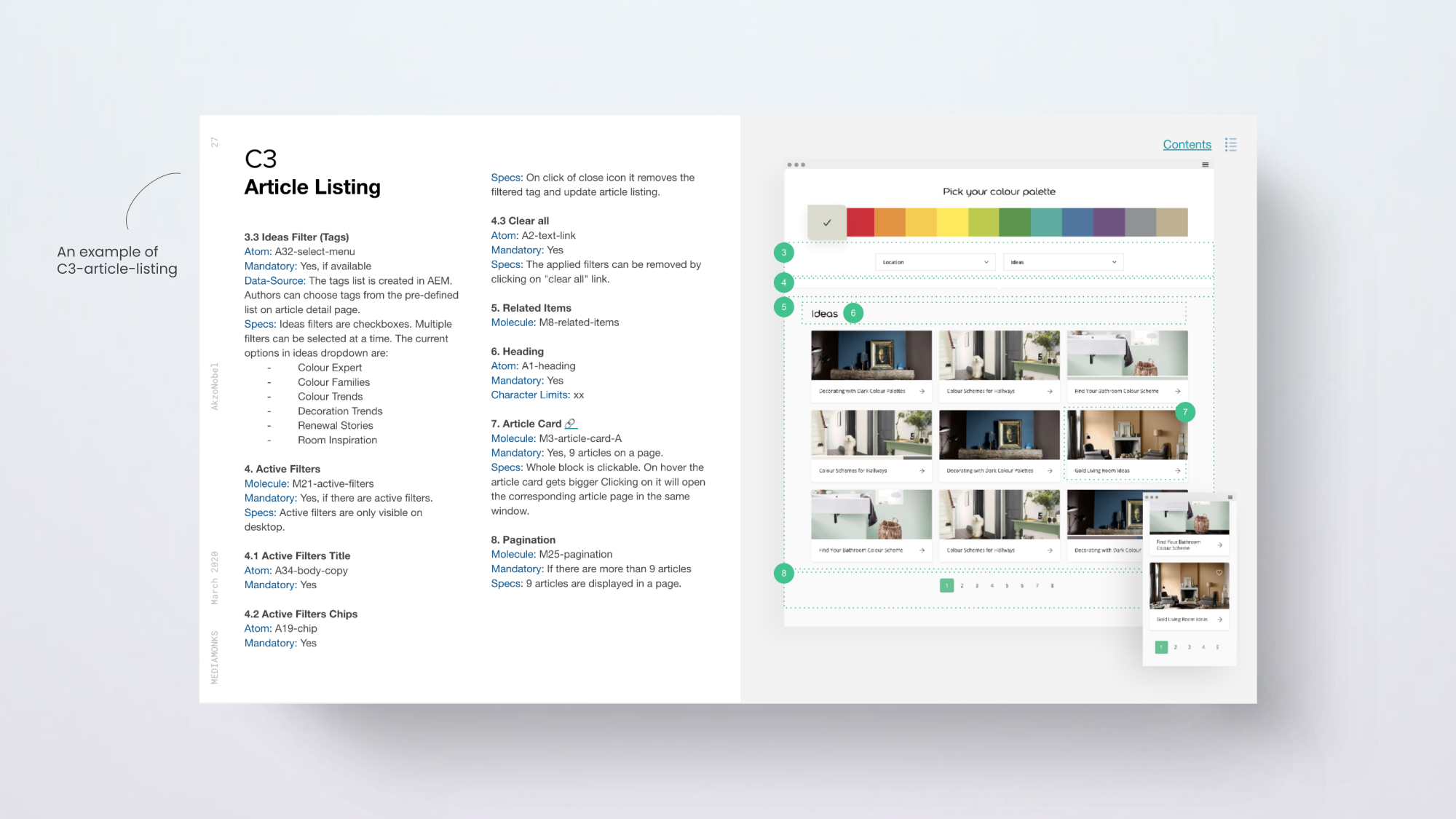
Handoff documentation from UX & Design to the development team, outlining the following details for each component in Google Slides:
- Component description: A simple description of the component.
- Data source: If the component is authorable or automatically pulls data from somewhere.
- Usage: In which pages, templates, or context you should use the component.
- Variations: In how many different styles the component may appear.
- States: In how many different states the component may appear.
- Scenarios: The minimum and maximum limits of the component.
- Character limits: If there is text in the component, how many characters are allowed.
- Image dimensions: If there are images in the component, what dimensions they should be.
- Mandatory and optional fields: Which elements in the component are required.
Technical documentation
Handoff documentation from developers to other developers and the QA team, outlining the technical details of the components and acceptance criteria.
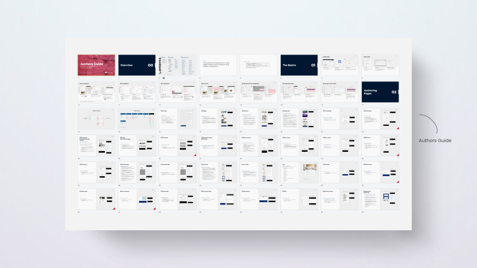
Authoring guide
Handoff documentation to content editors outlining how to use and configure the components in Adobe Experience Manager, including content best practices for a component to look its best.
Reflections
After six months of tedious work and extensive documentation, we successfully lifted and shifted three MVP websites, including www.dulux.co.uk ↗, www.flexa.nl ↗, and www.lesonal.com ↗. At this point, all other markets were motivated enough to adopt the design system.
Some learnings
Content-first component design: no matter how flexible your components are, they hinder design and content freedom at some point, so it's crucial to align the components library with the content strategy first, so you never have to forcefully squeeze copy into a component that ends up breaking the design.
Tooling limitations: Sketch is a solid design tool, but it lacks some basic design system features. It gets slow and clunky when using nested symbols and can cause problems with Zeplin export.
Tooling opportunity: Figma could have been a better choice for this project, letting us use just one tool for design, version history, handoff, collaboration, and documentation.