Designing a CMS for live sports streaming.
A B2B platform as a service giving broadcasters an out of the box way to engage audiences with sports content, built to sit alongside the likes of YouTube, Twitch, and Netflix.
Overview
This project is a B2B platform as a service, an out of the box solution for broadcasters to engage their audience with sports content in a fun and interactive way. The vision is to become the best in class digital video platform, alongside the likes of YouTube, Twitch, and Netflix.
My challenge was to design a powerful tool for broadcasters to manage live sports streaming through a CMS. I was fortunate to lead all aspects of UX design, from research to ideation, and to support the development team throughout.
To comply with my non-disclosure agreement, I have omitted confidential information in this case study. The nature of this work is strictly confidential. Please don't disclose or use this information other than reviewing my work.
Research
Firstly, I wanted to understand the complicated domain of live streaming, especially the commercial aspect of the platform and how the back end works.
Secondly, I wanted to develop empathy for the operators who regularly manage and monitor sports data, and understand their CMS pain points and day-to-day activities.
Here are some of the research techniques I used:
Method #1: Desk research
As part of desk research, I first gathered contextual information about the live streaming market. At first it was challenging to benchmark this product, since it's not always possible to peek into other similar back-end systems.
So instead of benchmarking, I looked at the general best practices of data-heavy B2B platforms, then based my UX approach on the following fundamental principles:
- Simplicity: Keep the interface clean and straightforward, and don't overwhelm users with many features at once.
- Consistency: Keeping behaviors consistent throughout keeps the learning curve low for users.
- Intuitive categorization: Tools should be where you'd expect. A good CMS means things have a clear structure and are easy to find.
- Automated and group actions: Save users time by automating everyday tasks and providing bulk operations.
- Provide contextual help: A great CMS should be self-explanatory, with inline hints and tooltips that explain things without the user having to look elsewhere.
Method #2: Stakeholder interviews
By performing in-person interviews with internal and external technical people, I learned the end-to-end live streaming process and how data ends up in the CMS, which helped me identify potential design constraints.
Method #3: Analysis of the previous CMS
I got access to a handbook detailing how the previous solution worked, alongside one of the stakeholder interviews. The in-depth analysis helped me define a baseline of crucial features for MVP, such as:
- Events schedule
- Monitoring
- Video management
- Image library
- Content management
- Competition data
- Audio commentary
- Translations
- Search
- Ad management
Method #4: Client workshop
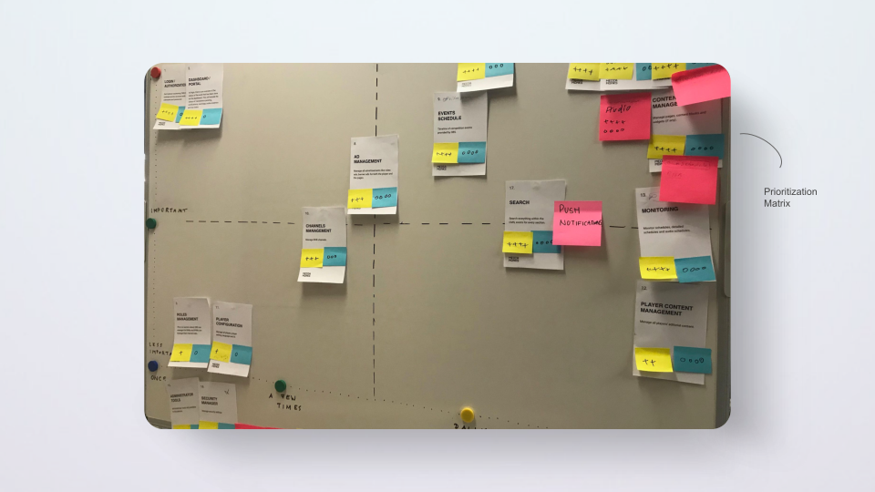
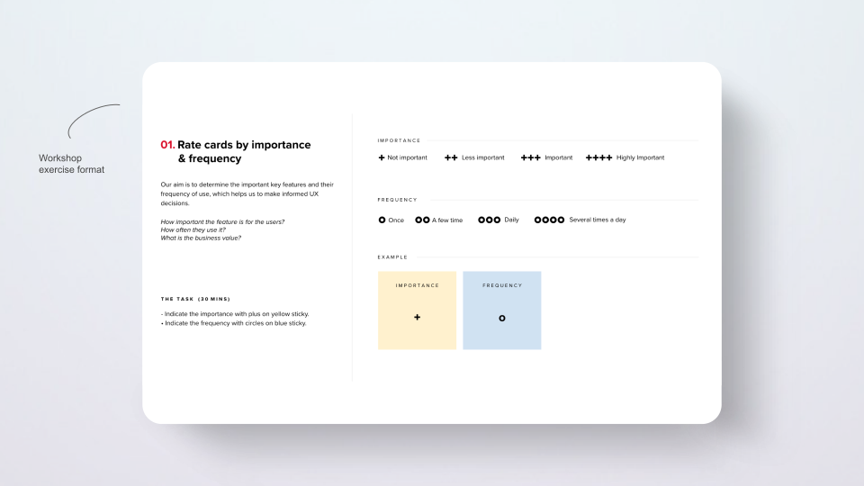
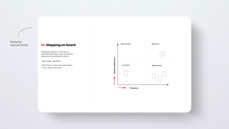
The client workshop helped me further understand the features from a commercial standpoint and prioritize them accordingly.
We ran an in-person feature prioritization exercise, rating each feature by its importance and frequency to ensure the most important and frequently used functions were accessible easily and quickly. This helped me tackle navigation issues and design a better content architecture.
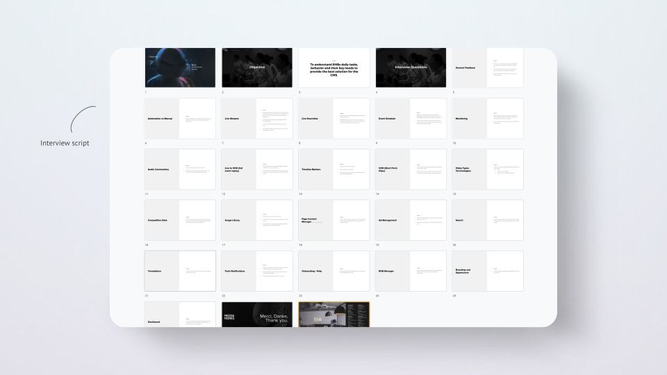
Method #5: User interview
To understand the problem from a qualitative perspective, I interviewed one of the CMS operators who had worked with the previous solution. This surfaced feedback on various pain points, mostly around the findability of key features and a hard-to-understand interface.
Key findings
- It wasn't easy to manage the live schedule.
- Issues with start/stop timings resulted in more video editing work afterward.
- The previous CMS was rigid and didn't allow for flexibility.
- Features were buried and not easily accessible.
- The interface wasn't easy to understand.
Strategy
Product-level architecture
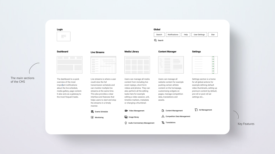
I categorized all features into logical sections based on the discovery insights, simplifying the structure and ease of access.
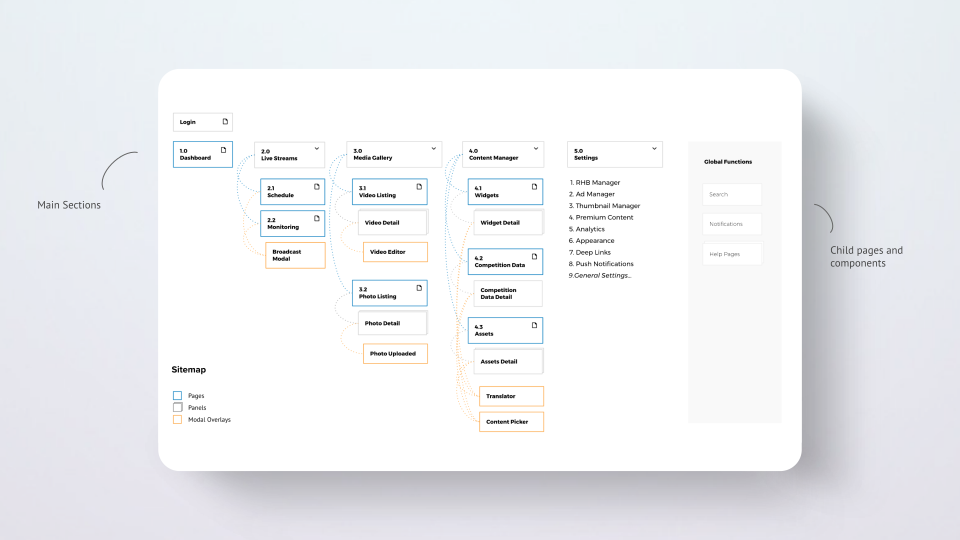
Sitemap
Creating a sitemap ensured that I placed the features intuitively.
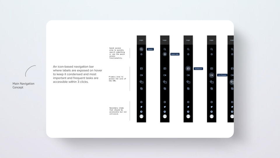
Navigation concept
Based on the sitemap, I developed the navigation concept, grouping navigation items into three critical areas based on their importance and frequency:
- Quick links: to quickly access starred items or search for something.
- Primary links: to access the core of the CMS.
- Secondary links: to access necessary but infrequent functionality.
Flow-level architecture
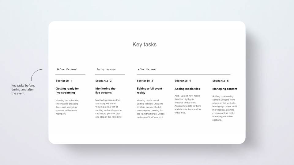
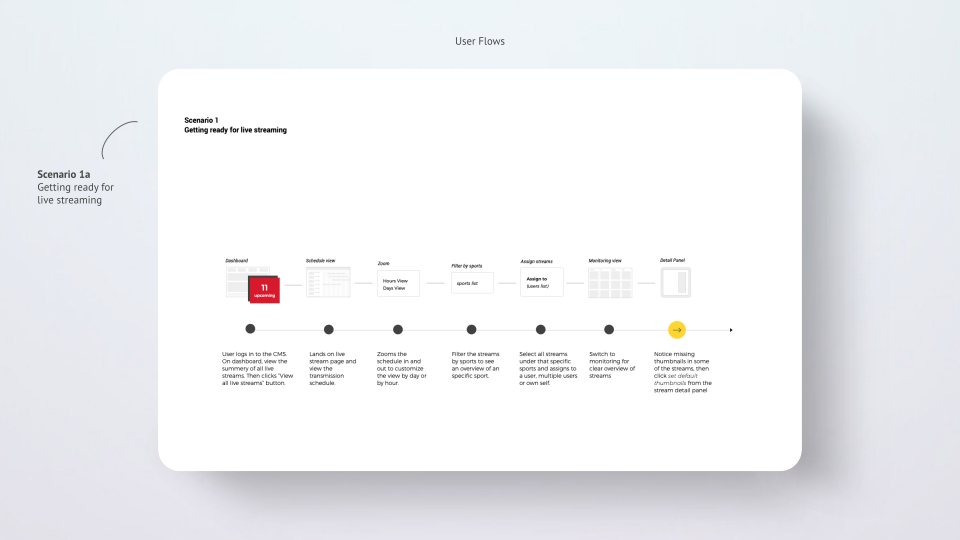
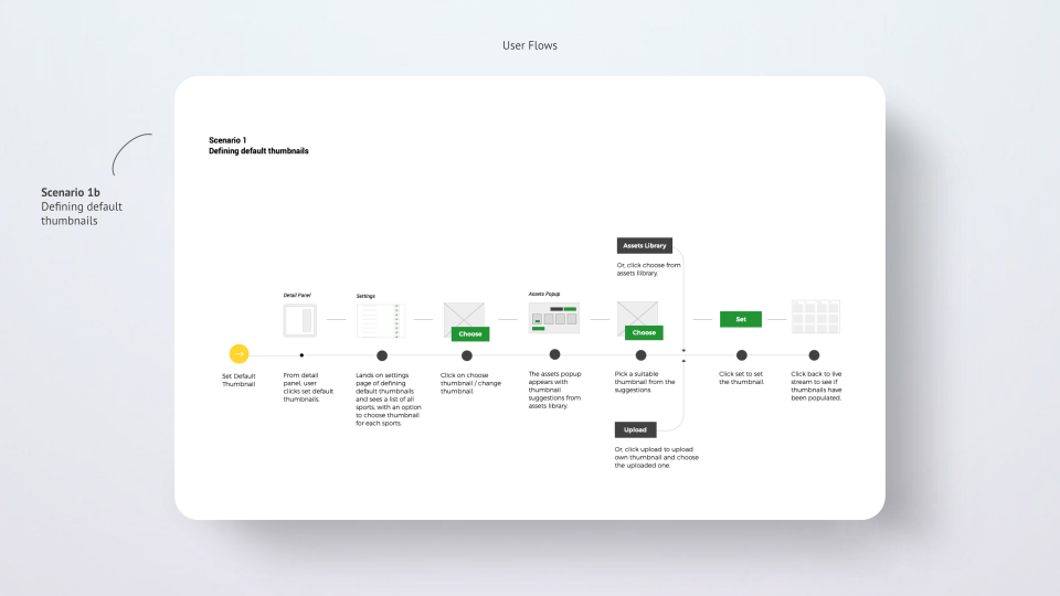
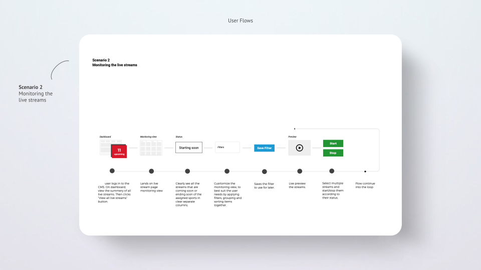
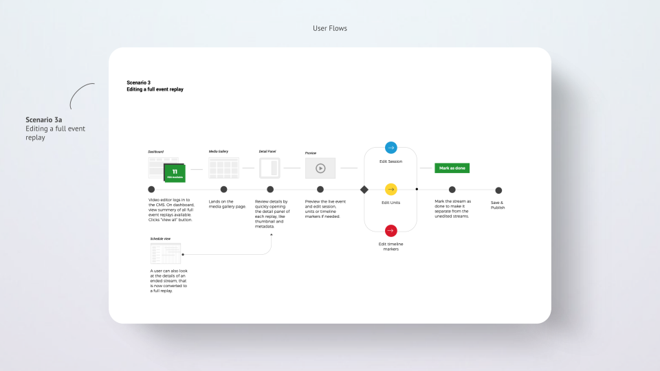
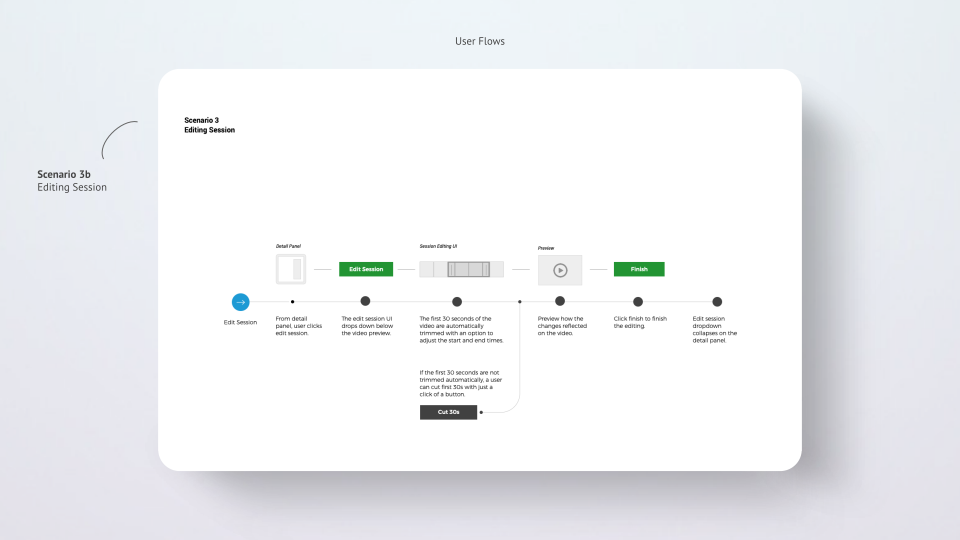
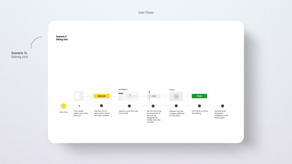
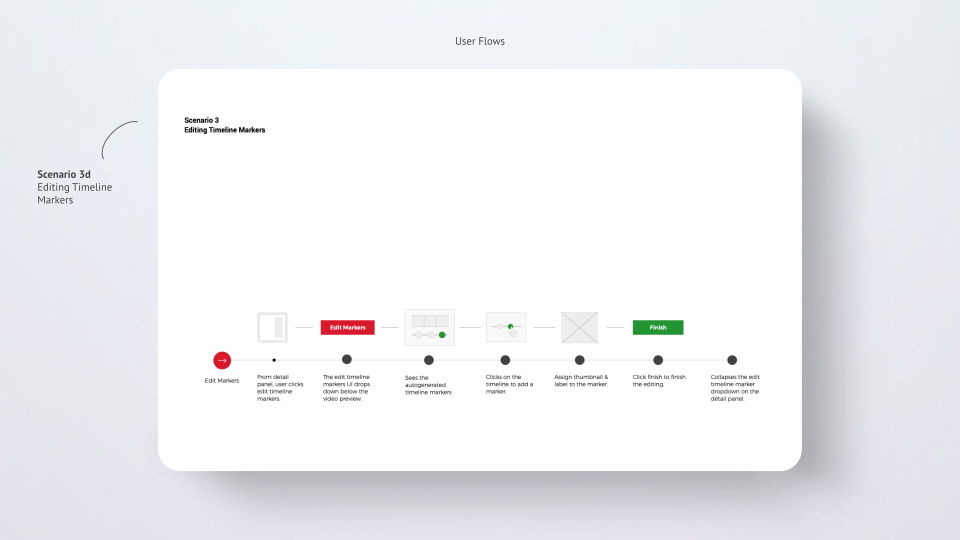
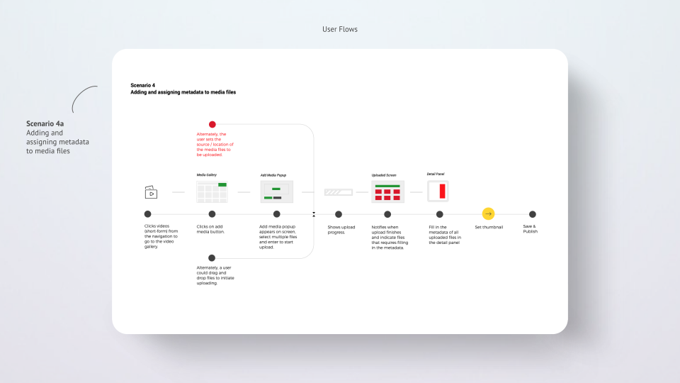
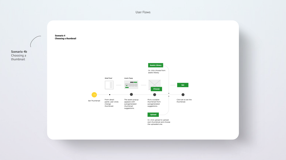
To visualize the operators' steps during a live event, I created a list of crucial tasks, then drew user flows to ensure the experience was smooth enough for operators.
Page-level architecture
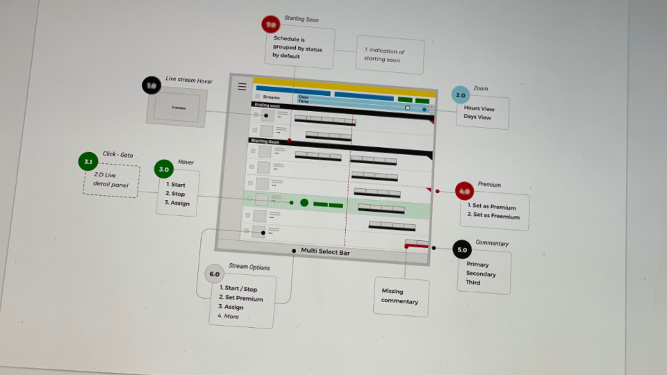
Before jumping into detailed wireframes, it was necessary to validate whether the features were easy to find and how operators would find their way through them.
For this purpose, I created low-fidelity mockups to visualize critical features on each page.
Tree testing
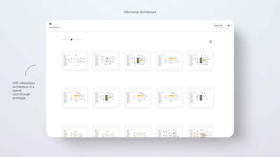
With tree testing, I wanted to observe how an operator responds to the new architecture. I ran an in-person tree testing session with the same operator who'd participated in the earlier interview, using tasks from the user flows and observing how he navigated through a Marvel prototype.
This exercise helped me understand whether the overall structure was optimal and performed as intended.
The operator completed most tasks successfully, except for a few things we relocated to a different place.
Design
Once confident with the information architecture, I proceeded to design each page, documenting all possible states, variants, and scenarios.
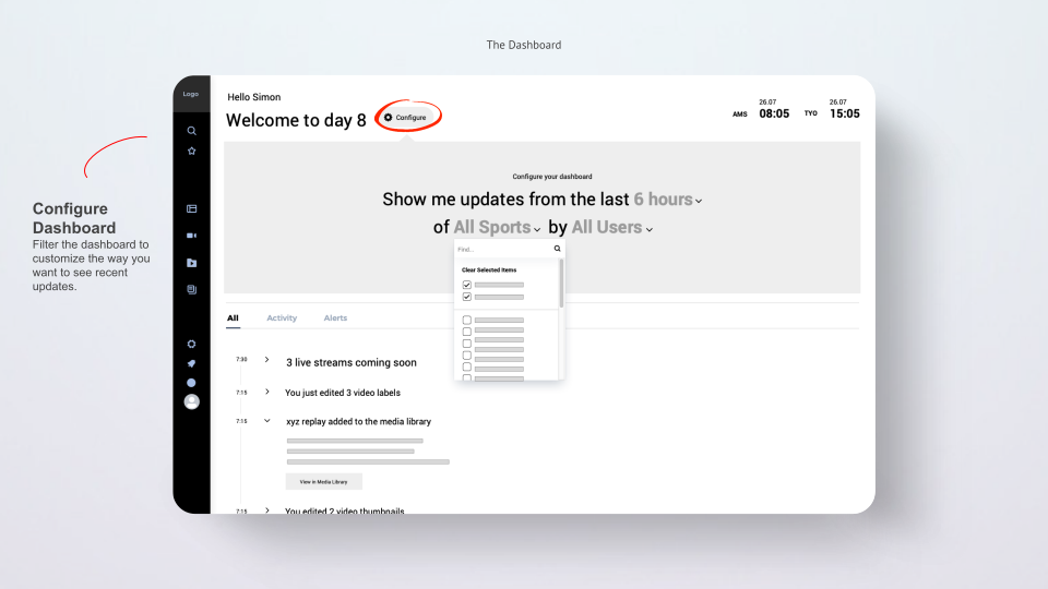
Dashboard
A quick overview of the most important notifications about the live schedule, media gallery, and page content — also a gateway to the most recent and frequent tasks.
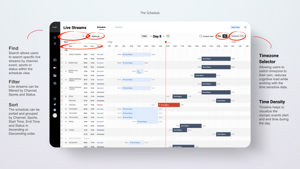
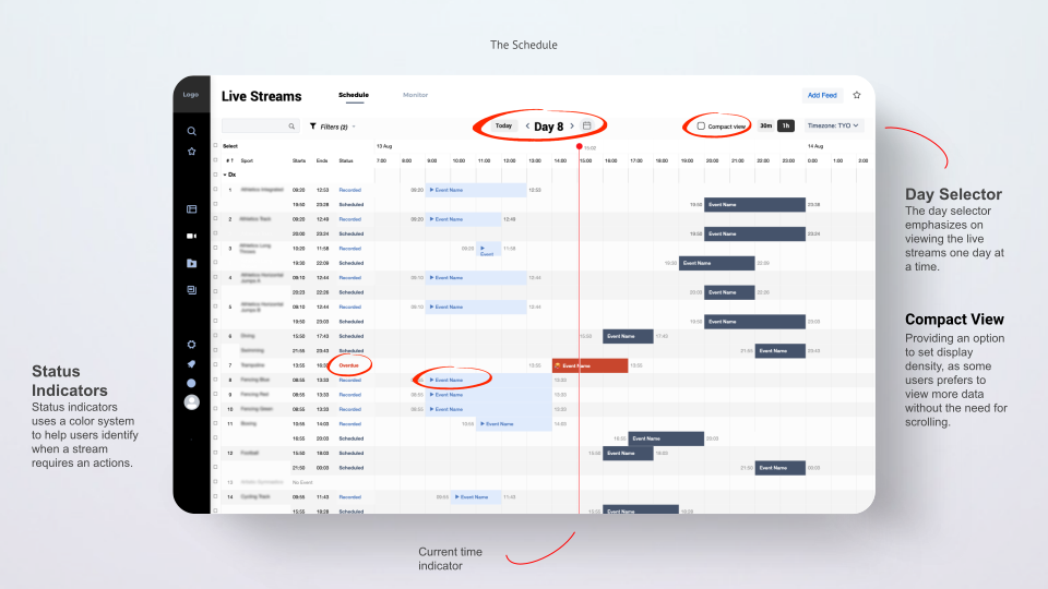
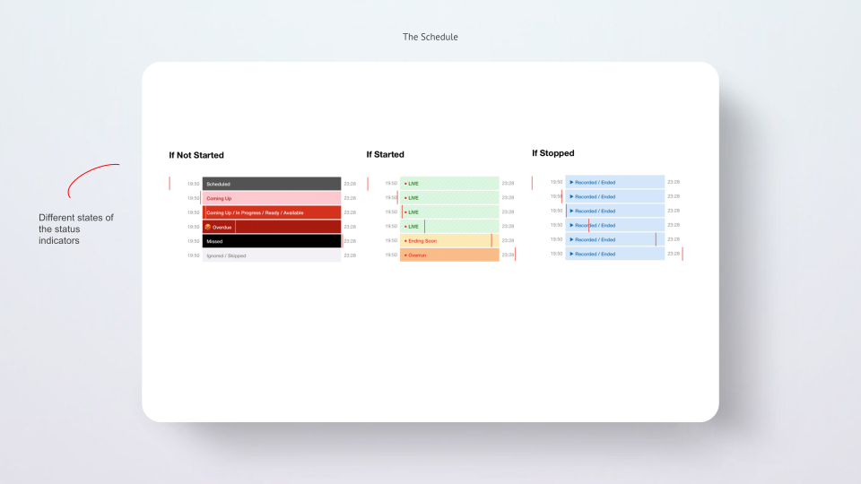
Schedule
Visualizes and organizes many live streams, making them easier to scan, query, and manipulate.
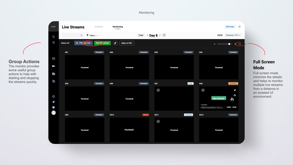
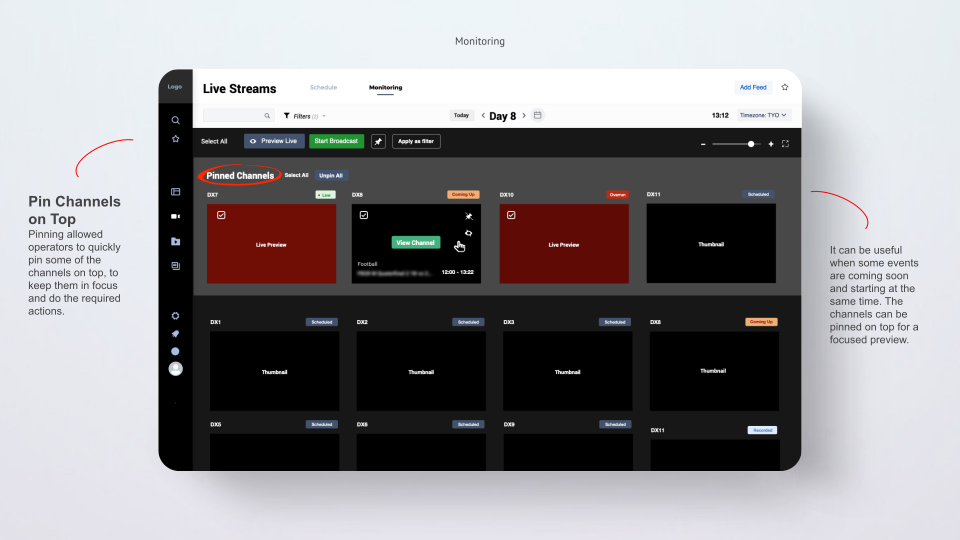
Monitoring
A visual display of channels makes it easier to monitor multiple live streams at the same time.
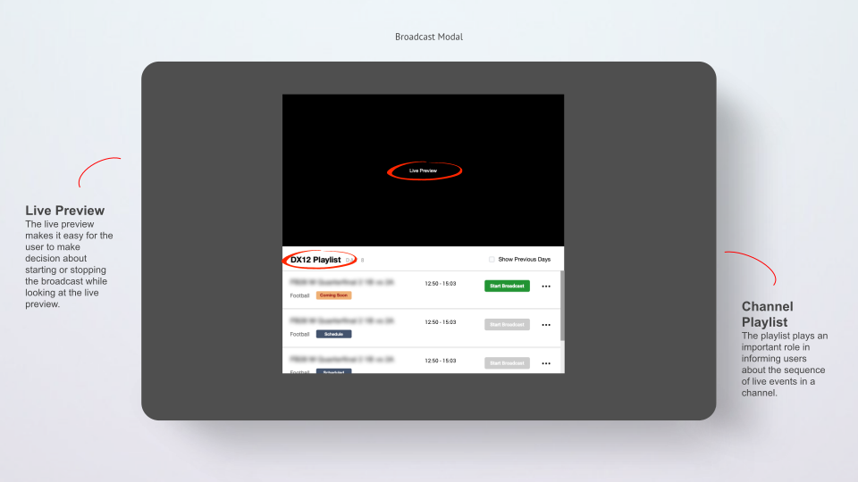
Broadcast modal
The core functionality of the CMS. An operator needed to start and stop the broadcast at the right time to avoid video editing and trimming afterward.
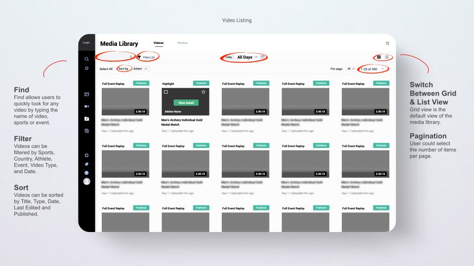
Media library
During live events, media files are added to the library in large numbers, including full-event replays, highlights, interviews, and photos.
The media library provides a list and grid view of all files, making it easy for operators to find and edit media quickly.
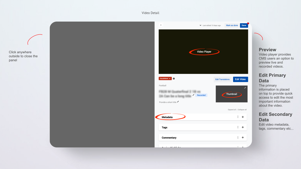
Media detail
A quick detail panel enables a user to view additional information while staying in context.
Video editor
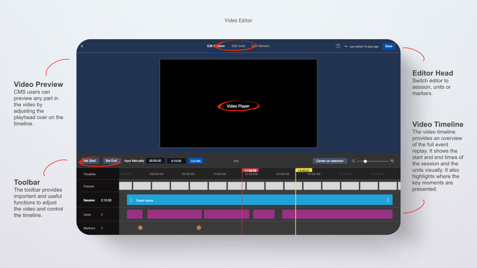
After a recorded event lands in the CMS, it requires adjustments to optimize the viewing experience for the end user.
Various tasks are involved in editing and optimizing the full event replay, including adjusting the video session's start/end time and managing chapters, units, and critical moments.
The video editor provides one seamless interface and set of tools to perform optimizations to the entire event replay.
Content manager
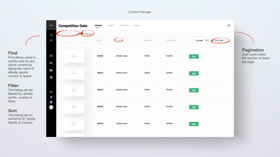
Hosts all data related to athletes, sports, countries, and teams, providing the ability to find and edit any sports detail, and to customize widgets and pages on the platform.
Reflections
Post-launch, we gathered feedback from live-ops operators through the game season to see how the CMS held up under real conditions:
Reliability under load: the CMS ran smoothly throughout the season. It reduced the overall chance of error during live streaming and gave operators one less thing to worry about mid-broadcast.
Productivity gains: operators reported a noticeable increase in productivity and ease of use, with the bulk operations feature singled out repeatedly as a standout. Several described the CMS as "a joy to use."
Comfort with ambiguity: this was a complex domain without a clear playbook. A key personal takeaway was learning to sit with unclarity, accepting that not everything can be mapped out upfront, and that some things are only figured out by moving forward and iterating in the moment.
Knowing when to ditch a tool: there were points where the tooling itself became the bottleneck, most notably working with tables and data inside Sketch, which turned into a real struggle. The lesson: the moment a tool starts fighting you, it's time to look for an alternative. Eventually I dropped Sketch for the data heavy screens entirely and designed them in a spreadsheet instead, which turned out to be far more effective for that kind of content.