Developing a Scalable Design System for Multi-Platform Experiences

Overview
AkzoNobel is a Dutch multinational company that creates paint and performance coatings for both industry and consumers worldwide. Today, many enterprises and consumers buy paint online. AkzoNobel aims to transform the digital experience of choosing and buying paint online and create a cohesive brand experience.
Challenge
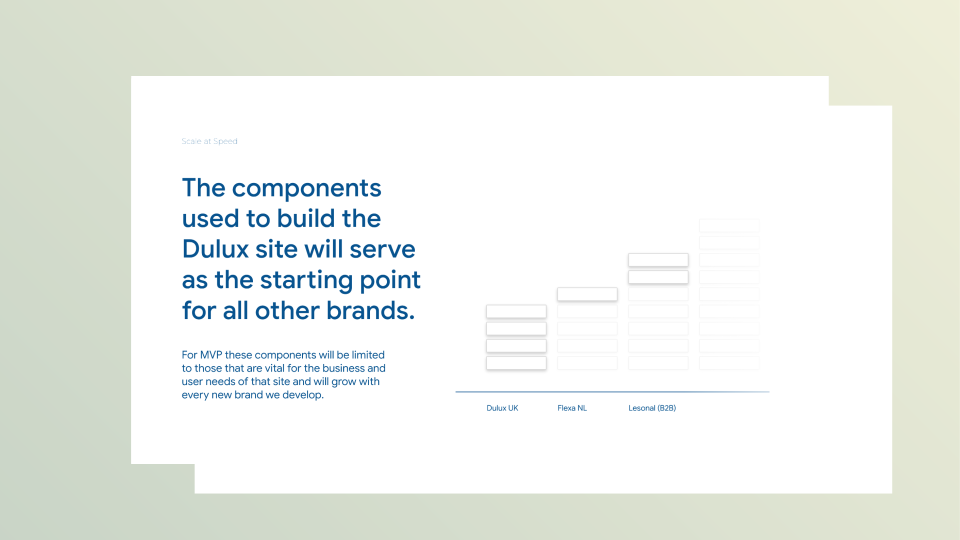
A key part of this transformation was migrating 100+ digital platforms from Drupal to Adobe Experience Manager. To make this scalable, we needed a flexible component library that could support multiple brands, markets, and use cases.
We started by building and validating the foundation across three MVP websites: Dulux, Flexa, and Lesonal.
The three MVP brand sites: Dulux, Flexa, and Lesonal.
My role
I led the UX contribution to the design system, from auditing the existing digital portfolio and defining the component architecture to designing, documenting, and evolving components in collaboration with designers, engineers, and the Project Manager.
Confidentiality note: To respect my non-disclosure agreement, I’ve omitted sensitive information, anonymized company and product names, and adjusted figures to protect confidential data.
Discovery
While the design team focused on foundational visual styles (defining color palettes, typography scales, and brand theming rules), the UX team set out to map our digital ecosystem. To create a system capable of supporting 100+ websites while keeping individual brand identities intact, we needed to address two core questions:
Discovery Questions
- Q1: Which universal patterns do all websites need?
- Q2: How should we structure the component library for long-term scalability?
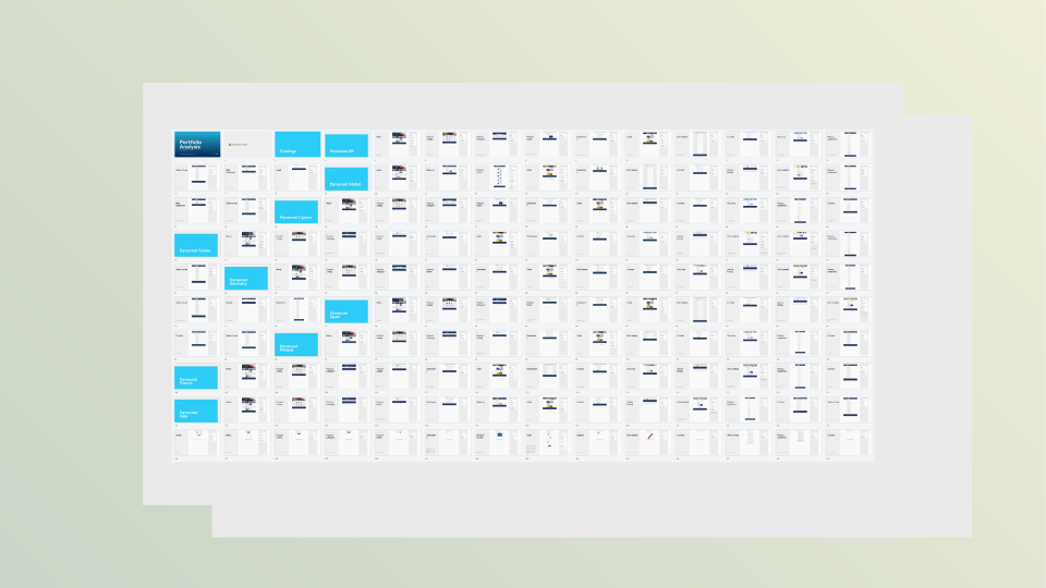
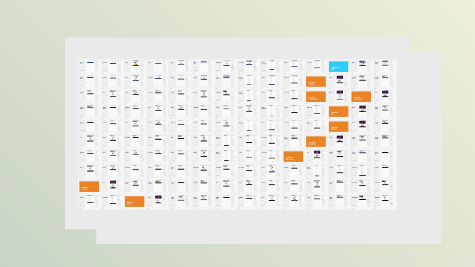
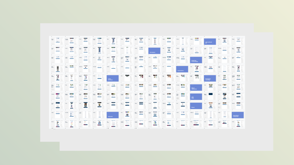
Activity #1: Portfolio & Component Analysis
We conducted a comprehensive audit across our entire portfolio, grouping websites into 16 brand clusters. Mapping recurring pages and layouts allowed us to separate universal necessities from one-off variations and establish a lean MVP component scope.
Activity #2: Structuring Methodology
We evaluated industry frameworks and partnered with our development team to adopt Brad Frost's Atomic Design methodology as the structural foundation for our library.
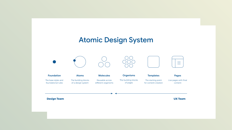
Atomic Design Methodology applied to the components library.
Strategy
With the audit complete, we translated the recurring patterns into a structured inventory of templates and components.
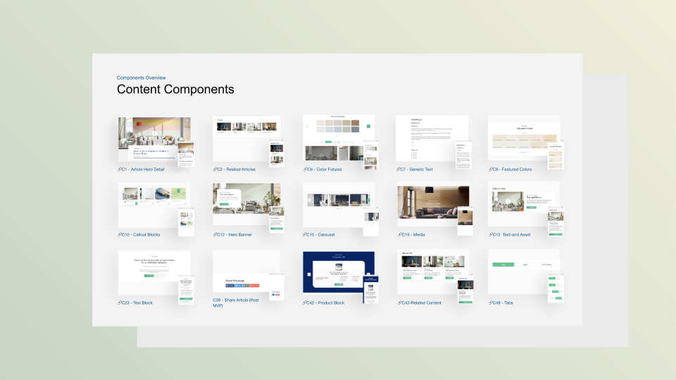
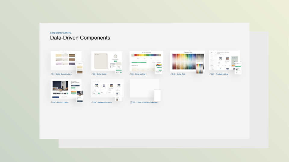
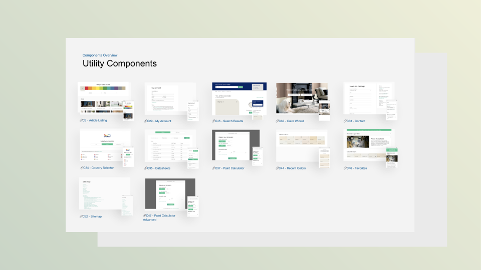
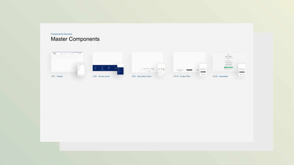
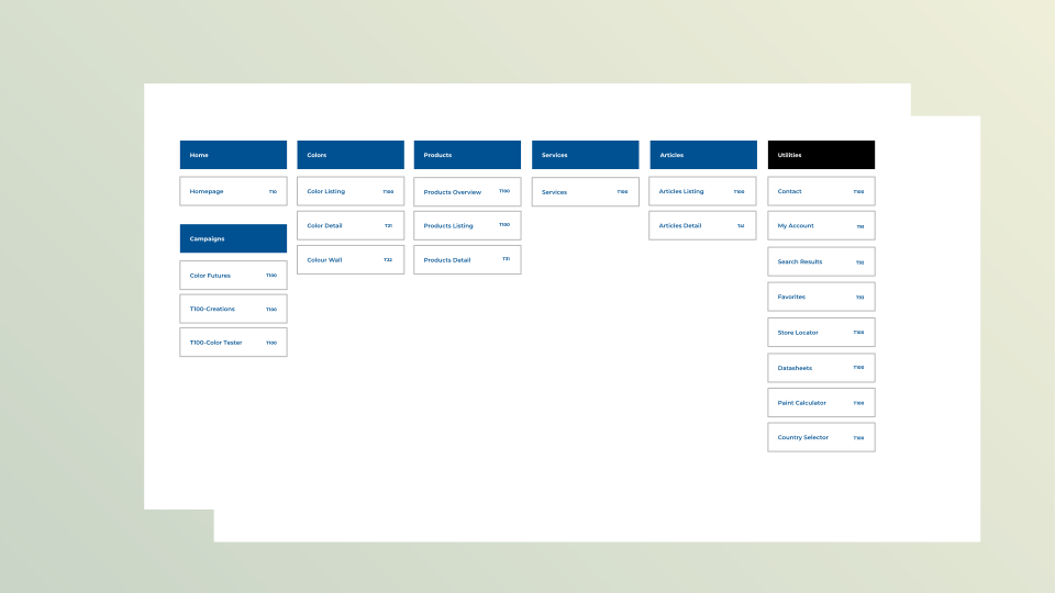
Sitemap of the compiled list of templates
Naming conventions
We also established a consistent naming convention so designers, developers, and other disciplines could use the same language across tools and documentation.
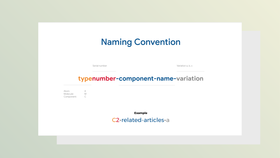
Naming convention used across disciplines, tools, and documentation.
Execution
We delivered 50+ components across ten 2-week sprints, managed through a shared component matrix spreadsheet.
Design & Handoff
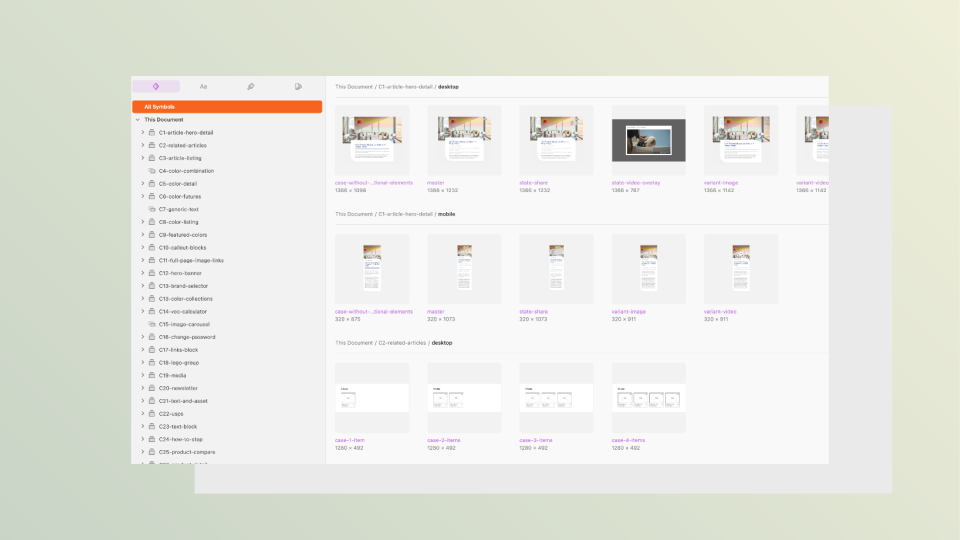
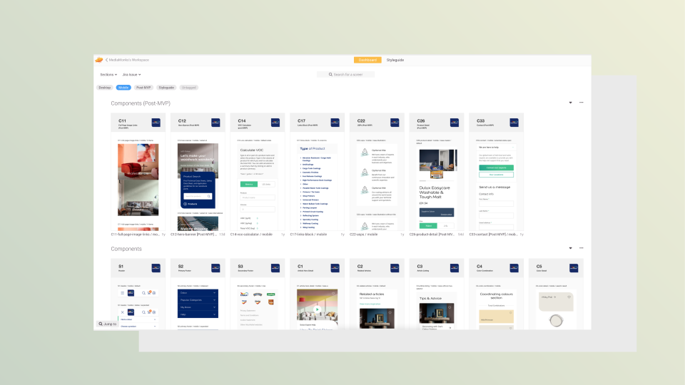
To fit the client's existing workflow and tooling, we selected Sketch and Zeplin over Figma or Adobe XD. We built the complete component library in Sketch with full variant and state definitions, handing off assets to development via Zeplin.
Documentation
To keep teams aligned across multiple brands and markets, we created two core guides:
#1 Handoff Component Documentation
Defines component rules, states, and usage patterns.
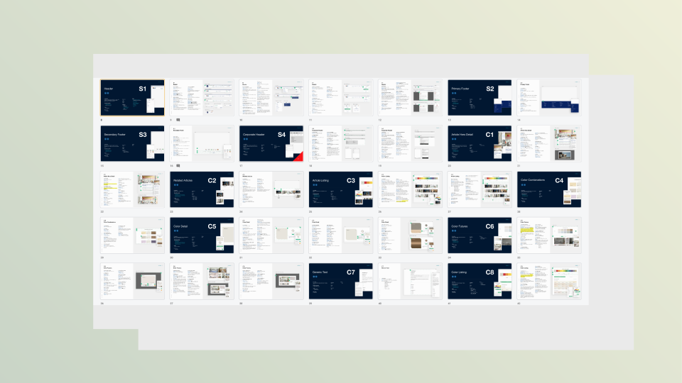
Handoff component documentation for the development team.
#2 Authoring Guide
Instructs content editors on configuring components in Adobe Experience Manager (AEM) and structuring content effectively.
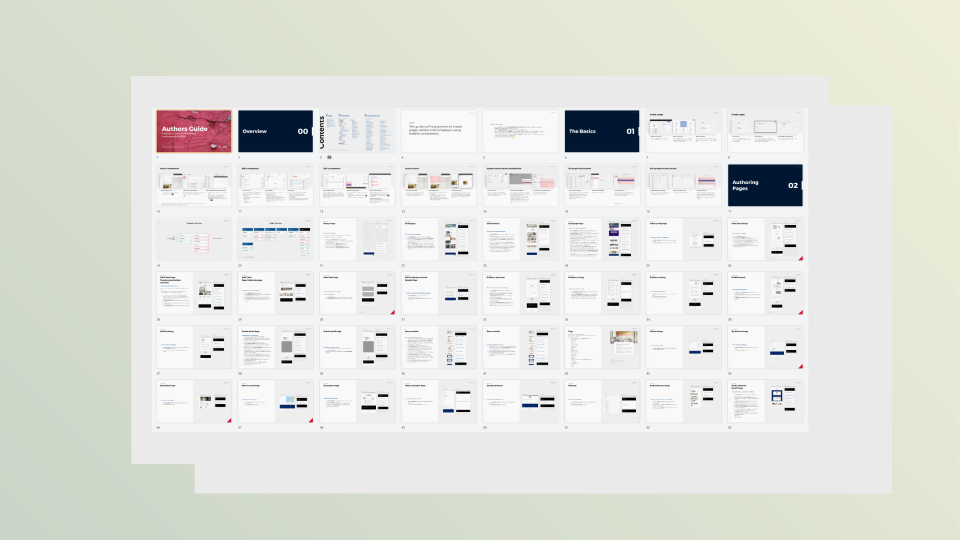
Authoring guide for content editors using components in Adobe Experience Manager.
Reflections
After six months, we successfully migrated three MVP websites using the new system. The MVPs demonstrated that the component library could support different brands while maintaining a shared foundation, which encouraged other markets to adopt the system.
Key learnings
- Tooling limitations: Sketch worked well within the client's existing workflow, but maintaining complex nested symbols became increasingly difficult as the system grew. Zeplin also introduced limitations when handling complex component states and variants.
- Tooling opportunity: With today's tooling, I would approach the workflow differently. A platform like Figma could bring design, version history, collaboration, handoff, and documentation closer together, reducing the friction we experienced across multiple tools.